Hotel Zuckerfabrik
relaunched.
An art deco boutique hotel in the middle of Stuttgart gets a digital presence that matches its room sizes: generous, stylish – and without detours on the way to booking.
About
the project.
In the middle of the former sugar factory site in Stuttgart Bad Cannstatt, right next to the Travertinpark, sits one of the city's most distinctive boutique hotels. Hotel Zuckerfabrik is built and furnished consistently in the style of the art deco era – with room sizes you rarely find in this category.
The goal of the relaunch: bring the digital presence up to the level of the physical experience – and make the distance between "looking at the site" and "booking a room" as small as possible. The hotel is run by E&K Hotel GmbH.
hotel-zuckerfabrik.de ↗ (opens in new tab)At a glance
- 52 deluxe double rooms · 31 m²
- 6 deluxe suites · 51 m²
- 1 penthouse suite · 298 m²
- Own underground car park & EV charging
- 200 m to the U12 light rail
The
requirements.
The old site ran solidly on WordPress – but it neither told how special the hotel is nor helped turn interest into a booking. The analysis turned up six points that defined the relaunch:
Six problem areas
- Welcome text in the hero only reachable after the first scroll – no booking incentive in view
- Transparent navigation over changing image sections – barely legible depending on the image
- Room categories as centred running text, without a single room photo in sight
- Availability check only via a detour to an external booking platform
- No consistent imagery – the hotel's art deco character didn't come across digitally
- No structure designed specifically for mobile, just a squashed desktop view
In a market where guests increasingly compare and book directly online, every unclear step in the process costs hard cash – and that's exactly where the relaunch was meant to start.
Old versus
new.
Same starting image, a completely different effect: as soon as headline, contrast and a direct way into booking are added, a pretty photo turns into a sales argument.
Desktop
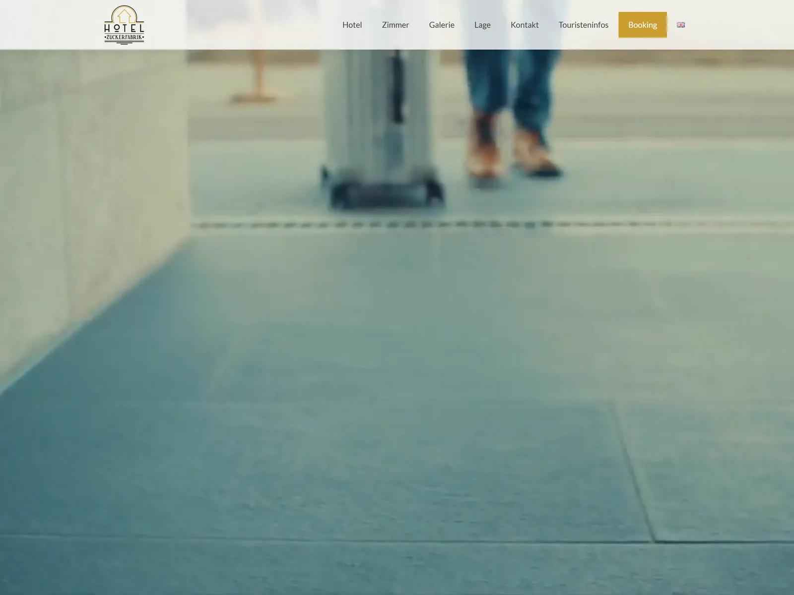
Transparent navigation, no booking CTA, no headline in the image.
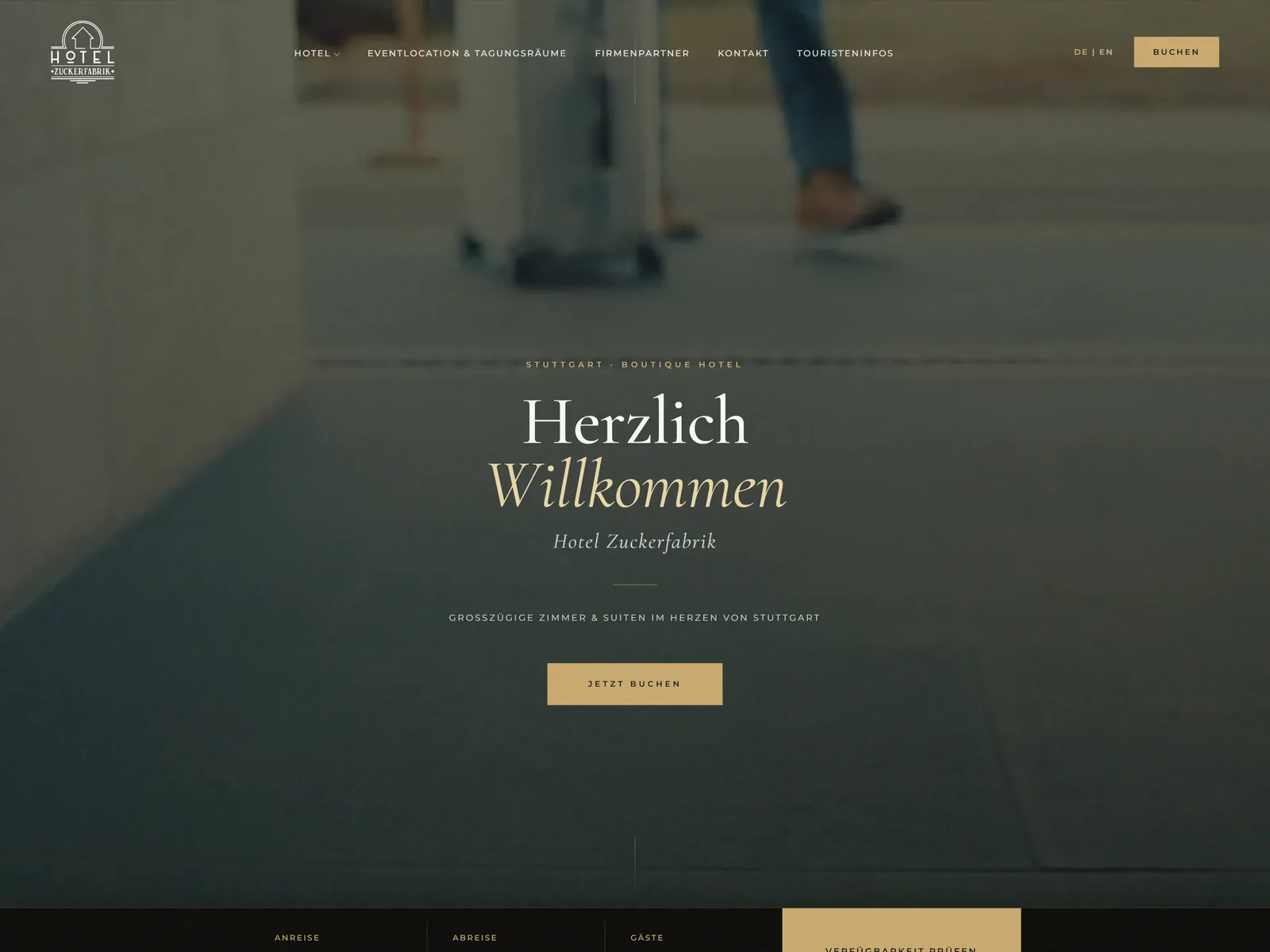
A clear headline, a visible "Book now" button, reviews right in the hero.
Mobile
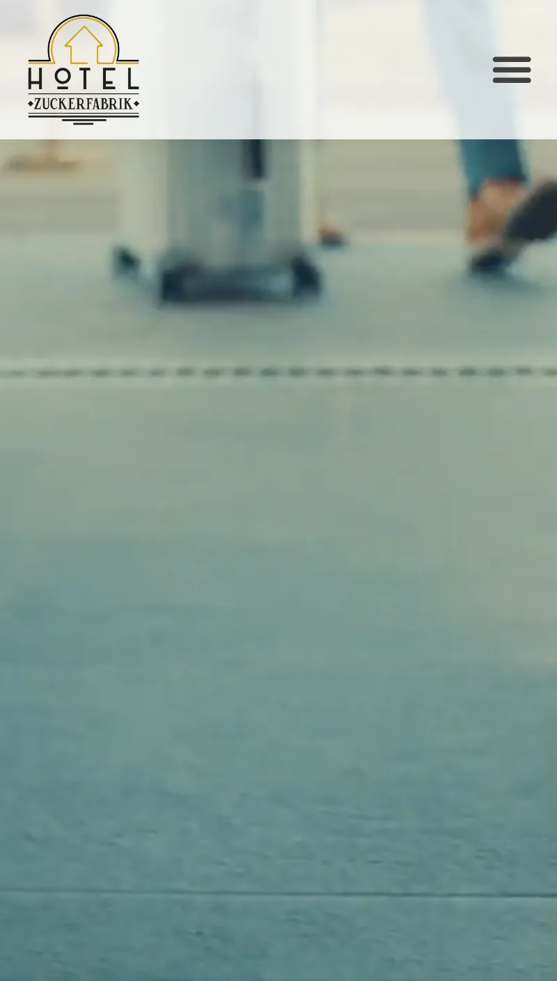
The same problem as on desktop, even more noticeable on a small screen.
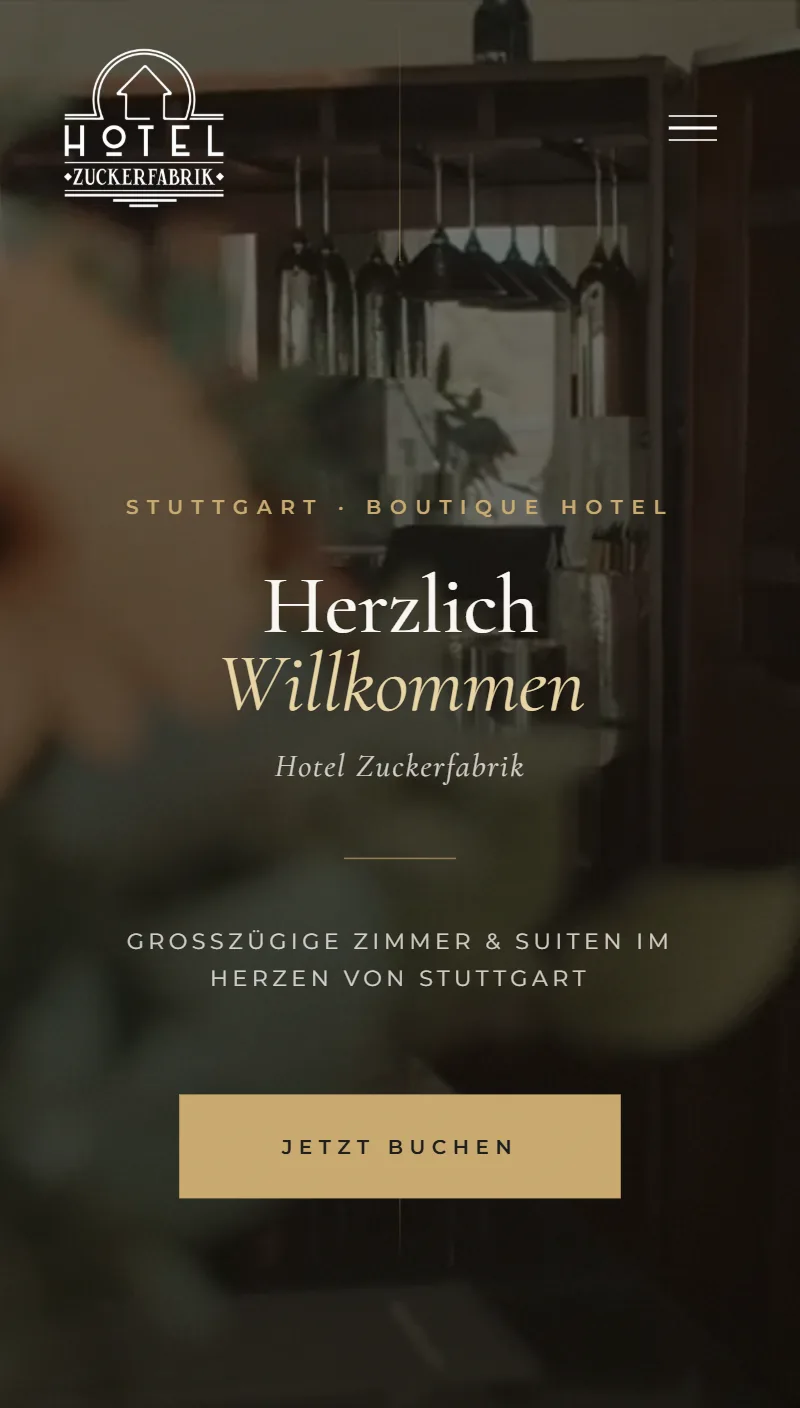
The same clarity, built specifically for mobile instead of just squashed down.
The
execution.
We didn't reinvent the hotel's art deco DNA, we thought it through to the end: fine serifs, warm gold tones, calm imagery – plus a structure that answers exactly the questions that count before a booking.
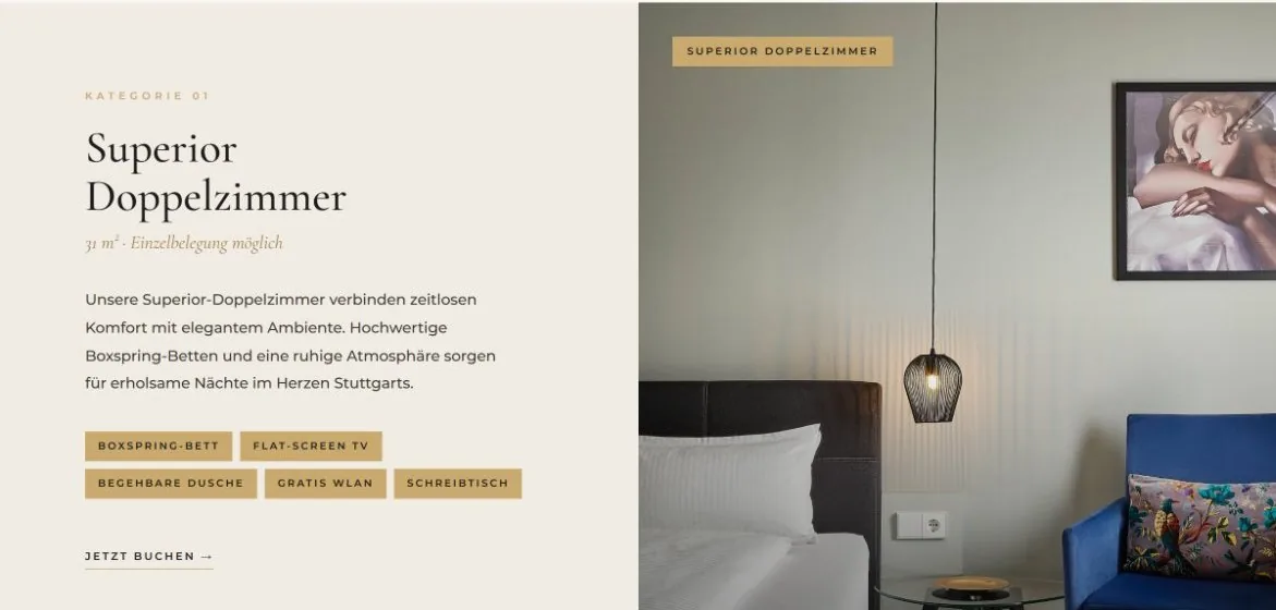
The building blocks in detail.
Content & room preview
Every room category as its own building block: photo, size, amenity tags and a direct booking link instead of running text.
Imagery & assets
A consistent image format per category (room, suite, exterior), so the art deco imagery feels equally calm on every page.
SEO & findability
Structured data for the hotel, clean meta information per page and a structure that makes it clear to Google too: boutique hotel, Stuttgart, art deco.
UX & design process
Click paths and information architecture clarified first, then imagery and polish – not the other way round.
Our
approach.
Analysis & scoping
Existing site, click paths and content reviewed, weak points named and the scope of the relaunch agreed together with the hotel.
Concept & prototype
Information architecture reorganised, art deco imagery sharpened, room categories planned as their own building blocks and tested as a clickable prototype.
Build
Design and development of the new site including the availability widget, tested down to mobile.
Launch
Polish, cross-device check and handover.
The
result.
A quiet image gallery has become a digital presence that immediately explains what the hotel stands for – and how to get a room there.
What changes for guests
- Booking CTA right in view – no more searching
- Navigation with clear contrast, over light and dark image areas alike
- Room categories with real photos, amenity tags and a direct booking link
- Check availability in seconds
- A consistent, calm art deco look from the first section to the last
More
insights.
You'll find more projects and case studies in the overview.
Related: Web design at TACOBITE · 7 signs you need a website relaunch (German) · Marketing Agentur Stuttgart (German)
Your hotel
deserves
the same.
Let's see where your website is still losing guests – and how we change that.
Taco date or video call • Free • No strings attached